UI Concept · E-Commerce · Mobile
Nike UI Concept
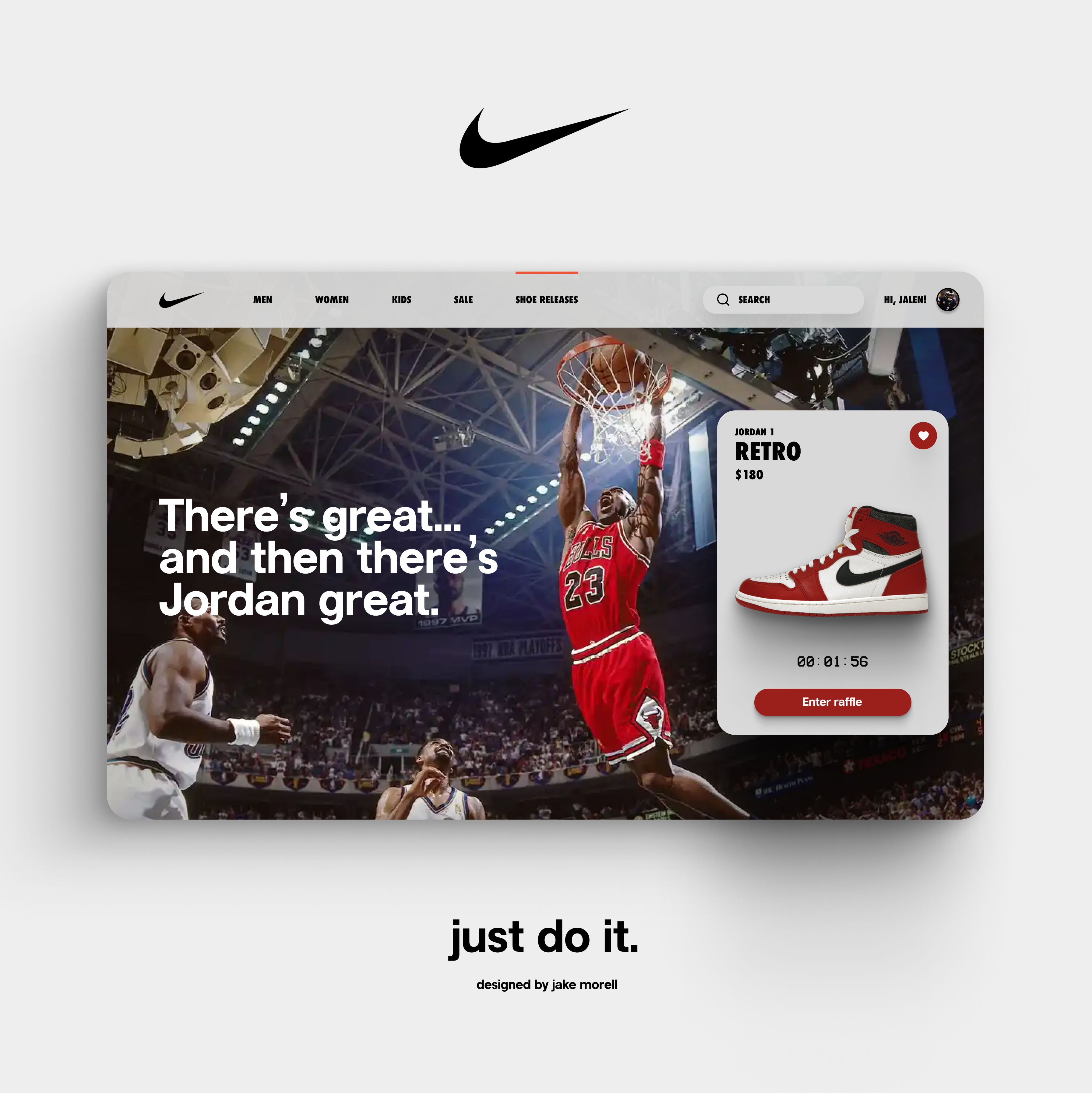
A bold, performance-driven reimagining of the Nike app, stripping the interface down to what athletes actually need: products, stories, and speed.
2023
A bold, performance-driven reimagining of the Nike app, stripping the interface down to what athletes actually need: products, stories, and speed.
Nike's brand is built on urgency, power, and human potential. This concept strips the interface to its essentials, making products the hero, reducing navigation complexity, and injecting the same energy you feel holding a Nike product into every scroll and tap.
Key design principles: black-first aesthetic that lets product color pop, bold editorial typography inspired by Nike's campaign print work, and friction-free checkout flows that turn browsing intent into purchase decisions.